
Creating Shot Charts
The StatMuse shot chart is a thing of beauty.
All those dots on your screen — shades of blue splashed across a court, dots both hollow and full, hexes clustered around an arc. Simply magnificent.
But how do you make one yourself? How can you make ones that can scroll through multiple charts? How do you make the really badass animated ones? After learning how to ask basic and advanced questions, we’re turning our focus to the crown jewel of the StatMuse platform — shot charts.
(Stats included are accurate as of the date of publication. Results may have since changed.)
Simple Player Shot Charts
The simplest way to generate StatMuse shot charts is to use the magic phrase: Shots. While using the full phrase “shot chart” will work, the shorthand “shots” will also return the beautiful blue charts. Also, since this isn’t Jeopardy, you don’t have to ask in the form of a full question. Just typing “LeBron James shots” will also work, but for the sake of this tutorial we’ll use the full question format.
For example, asking “What is LeBron James’ shot chart?” or “What are LeBron James’ shots?” will give you this chart:
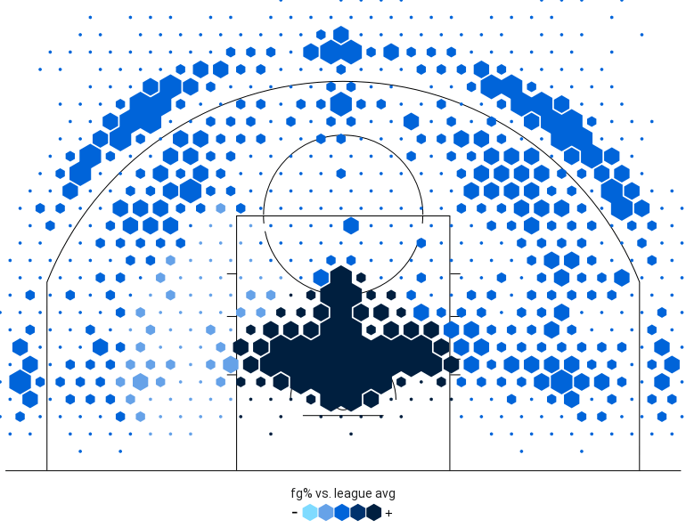
Since the question didn’t specify a timeframe, this includes every regular-season shot LeBron has taken in his career (for playoff shot charts, simply add “in the playoffs”). You can even add qualifiers to narrow down your results.
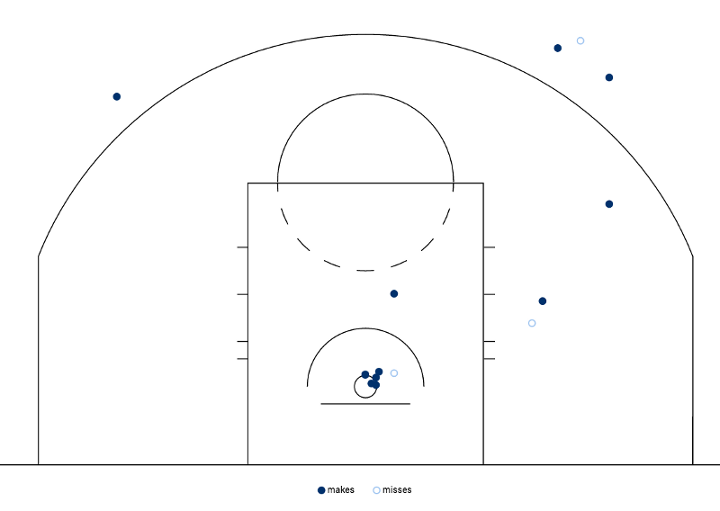
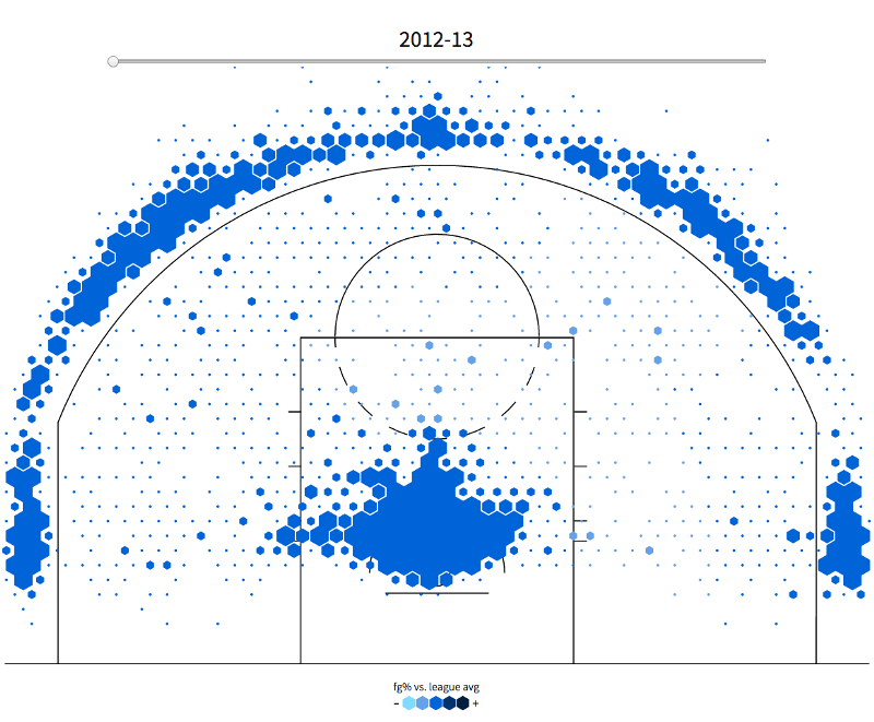
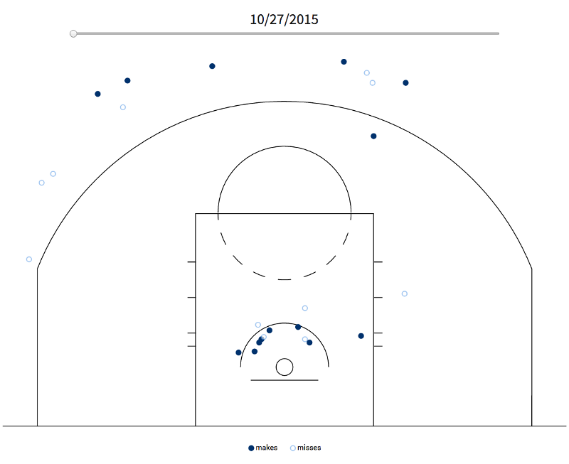
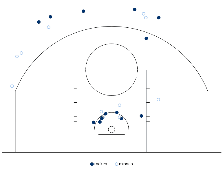
Your stealthy eyes no doubt noticed the difference in appearance between these two charts, the first with large hexagon clusters, the second with sparse dots. When a shot chart includes a result set with under 100 attempts, they are presented as individual makes and misses. If the results feature over 100 shots, they cluster together based on the number of shots attempted in that region (the bigger the hexes, the more shots attempted). They are color-coded based on how the field goal percentage in question compares to the league average at each spot. Click through and hover over over each region to get exact percentages.
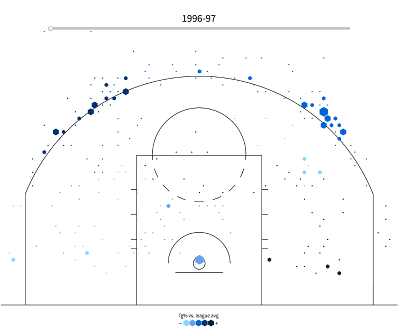
You can also expand player shot charts to see how they evolved through their career. For example, ask “What is Kobe Bryant’s shot chart by season?” to get a scrollable season-by-season look at his progress from tempered teenage phenom up to volume-shooting god and back down to whatever it is that’s left of him after injuries and father time did their thing.
Simple Team Shot Charts
You can also generate shot charts based on a team’s performance. Simply specify a team and a timeframe to get the results.
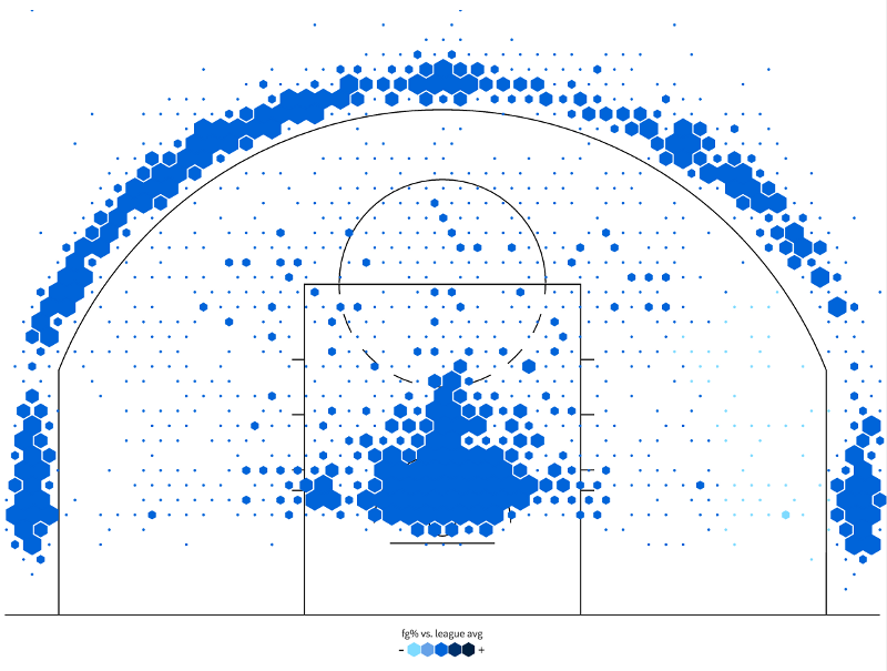
Based on this chart, it appears the Rockets are living up to the Moreyball edict that dictates a firmly-raised middle finger to all midrange jumpers. You can see how they’ve followed that strategy over the last few seasons by specifying a range of seasons that can be scrolled through by season.
Click through and scroll through each season and see how the endangered midrange jumper has gone nearly extinct in Houston.
Animated Shot Charts
If you’ve made it this far and your socks are still on, we’re about to blow ’em right off. By using the magic phrase “cumulative shots,” you can generate animated shot charts.
Searching cumulative shots requires setting a timeframe to work. Like the time-based searches above, it generates multiple scrollable charts, only each chart builds upon the data of the previous chart until the final chart displays a full cumulative display of shots in the timeframe specified.
For example, searching “Stephen Curry cumulative shots by game this season” gives you a scrollable shot chart where you can see how each game adds to his overall total:
If you click the share arrow in the right-hand corner, you’ll get the option to download the visualization, just like with any other search. However, unlike any other search, the file you download from cumulative shots questions will be an animated GIF that you can share across social media:
In addition, if you share a cumulative shots question to your followers on StatMuse, it will animate in their feed.
PLEASE NOTE: If you get an error message when trying to download the GIF or the search doesn’t display initially when you share it on StatMuse, please give it a minute or two and try again. Some animations take a little bit to render.
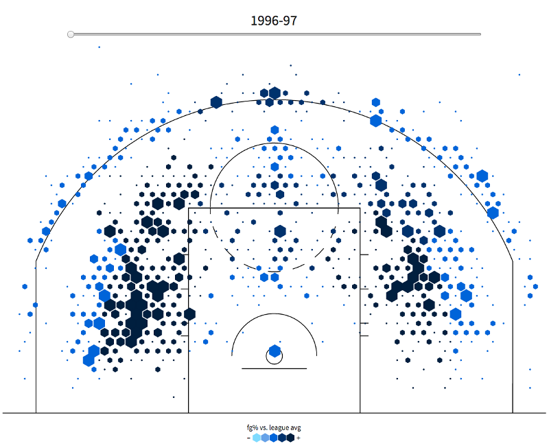
Historical Shot Charts
While it would be really cool to see Pistol Pete’s shot chart or track Jordan’s career progress, the NBA shot location data we have available to us only goes back to the 1996–97 season. Still, even with this limitation you’re able to see the last two years of Jordan’s dominance in Chicago and the two seasons in Washington that we all pretend never happened:
Try It Yourself
Now that you’ve seen some examples of how to create your own shot charts on StatMuse, it’s time to put your knowledge into practice. Log in to StatMuse and create some yourself. If you need any help, click on the live chat icon in the bottom right-hand corner or send us a message on Twitter and we’ll answer any questions you may have.
Next, we’ll prove that there is a use for math after graduation in a look at the StatMuse math engine.
